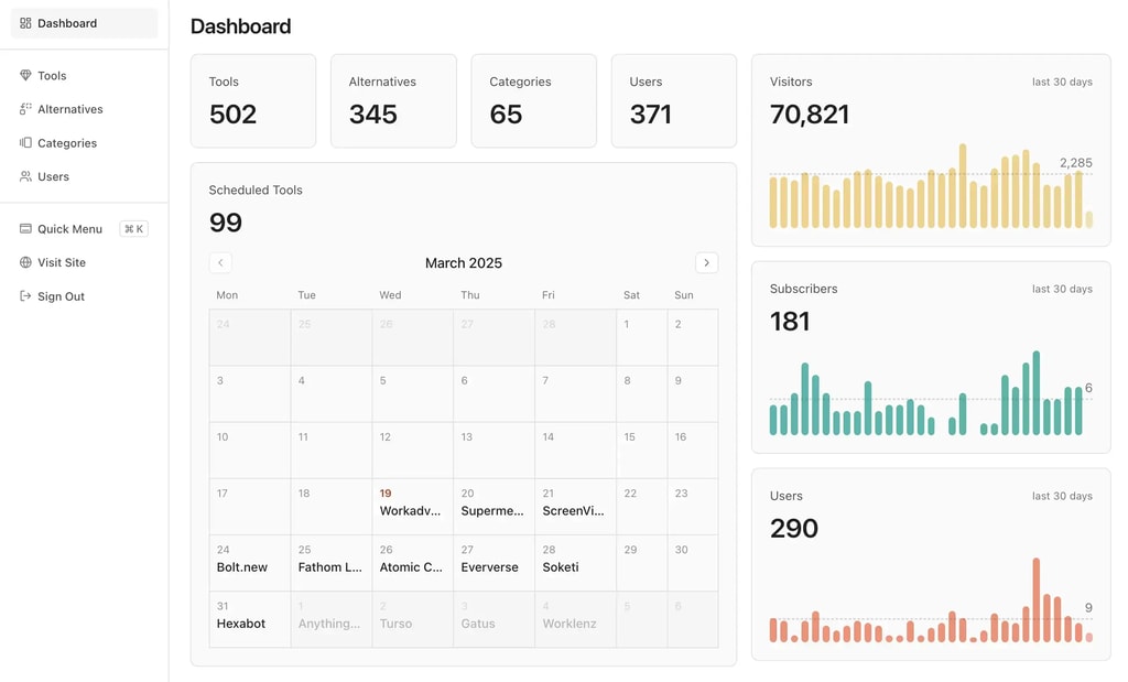
Don't waste time on Stripe subscriptions or designing a pricing section. Get started today with our battle-tested stack and built-in monetization features.
A proper navigation menu on desktop and a full-screen panel on mobile, both driven by one config file
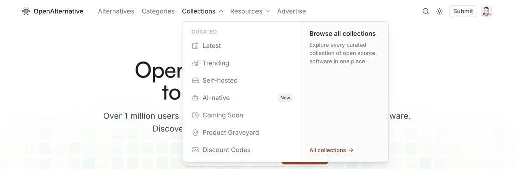
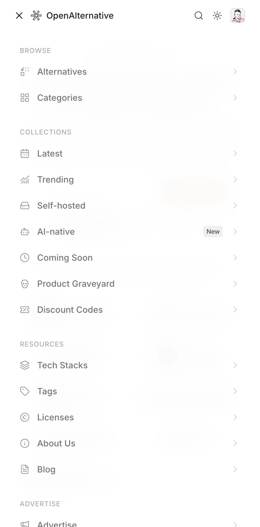
The header outgrew its dropdowns. As the site gained collections, resources, and more content pages, a flat row of links stopped scaling. The navigation has been rebuilt on both breakpoints, driven by a single config.
Top-level groups can now open as a two-column menu: links on the left, a promotional panel on the right pointing at whatever you want to push: a hub page, the submit form, an upgrade.
Built on Base UI's navigation menu, so it's keyboard-navigable and screen-reader friendly out of the box. The popup morphs between groups instead of closing and reopening, and links highlight when you're on the current route.
Mobile gets a full-screen panel instead of a cramped dropdown. Groups are rendered as titled sections, and it closes on Escape and on every route change.
Drop menu: true and the group's links render flat in the header instead. Labels are i18n keys resolved at render, so navigation translates with the rest of the site. Change a link once and it updates on desktop, mobile, and anywhere else the config is read.