Don't waste time on Stripe subscriptions or designing a pricing section. Get started today with our battle-tested stack and built-in monetization features.
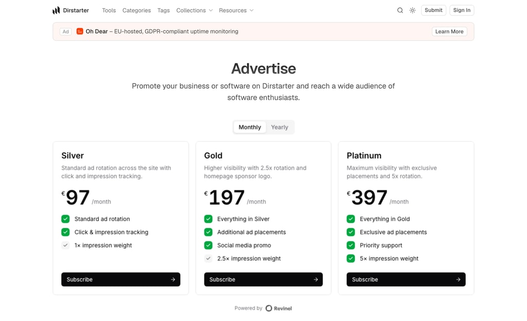
Dirstarter's ad system moves to Revinel, with a hosted pricing page, ad-blocker-resistant serving, and advertisers who pay you directly
Dirstarter's built-in advertising has moved to Revinel, a dedicated ad-serving platform. The old system stored ads in your database and made you build every campaign by hand in the admin. Revinel runs it end to end: pricing, checkout, rotation, and tracking.
Create a Revinel workspace, connect Stripe, and copy your workspace id into NEXT_PUBLIC_REVINEL_WORKSPACE_ID. That one variable is the switch. Set it and your /advertise page starts showing tiers while ad slots across listings, tool pages, and blog posts begin serving. Leave it empty and the entire ad surface stays hidden, so a fresh clone still builds and runs.
Because ads are fetched at request time and rotate on a stable window, a visitor sees a consistent set while they browse, and new bookings appear without a redeploy.
Upgrading an existing site removes the old Ad table, so export any live campaigns before you migrate. The Monetization guide covers setup, the ad fields to configure in Revinel, and how placements map to tiers.
Send directory events to your own automation with a single webhook
Dirstarter now emits domain events (tool submitted, tool published, tier upgraded, report created, and more) and can deliver them to an outbound webhook alongside the existing email notifications.
Set WEBHOOK_URL and every event starts POSTing a small JSON envelope to your endpoint. Wire it to n8n, Zapier, Make, or anything that speaks HTTP to automate whatever you like: share newly published tools on socials, ping Slack on a new report, sync to a CRM. It's off by default, and an optional WEBHOOK_TOKEN secures the receiver.
Because each event says plainly what happened and to whom, you can point the webhook straight at an AI agent node in n8n or Make and let it take it from there. Publish a tool and have the agent draft and post the social announcement. Get a report and let it triage the tool and write you a summary. Onboard a submitter with a personal follow-up. No glue code, just a prompt.
See the Webhooks documentation for the payload shape, the full event list, and how to add your own.
A proper navigation menu on desktop and a full-screen panel on mobile, both driven by one config file
The header outgrew its dropdowns. As the site gained collections, resources, and more content pages, a flat row of links stopped scaling. The navigation has been rebuilt on both breakpoints, driven by a single config.
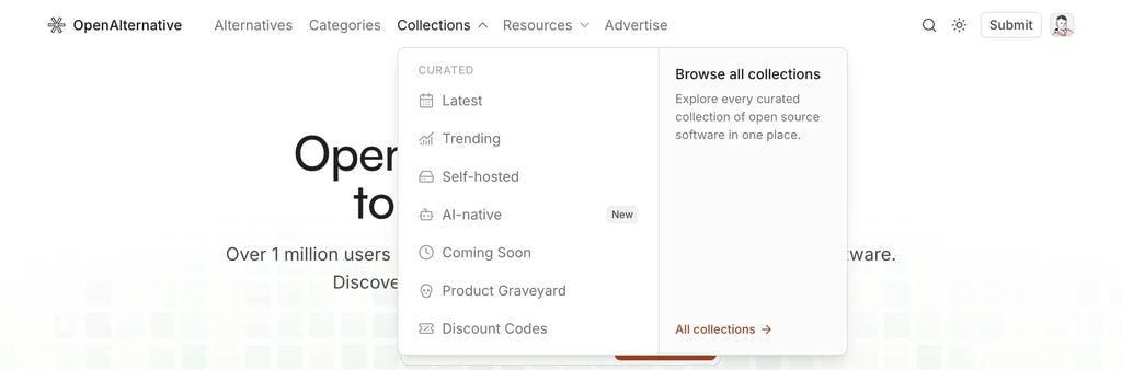
Top-level groups can now open as a two-column menu: links on the left, a promotional panel on the right pointing at whatever you want to push: a hub page, the submit form, an upgrade.
Built on Base UI's navigation menu, so it's keyboard-navigable and screen-reader friendly out of the box. The popup morphs between groups instead of closing and reopening, and links highlight when you're on the current route.
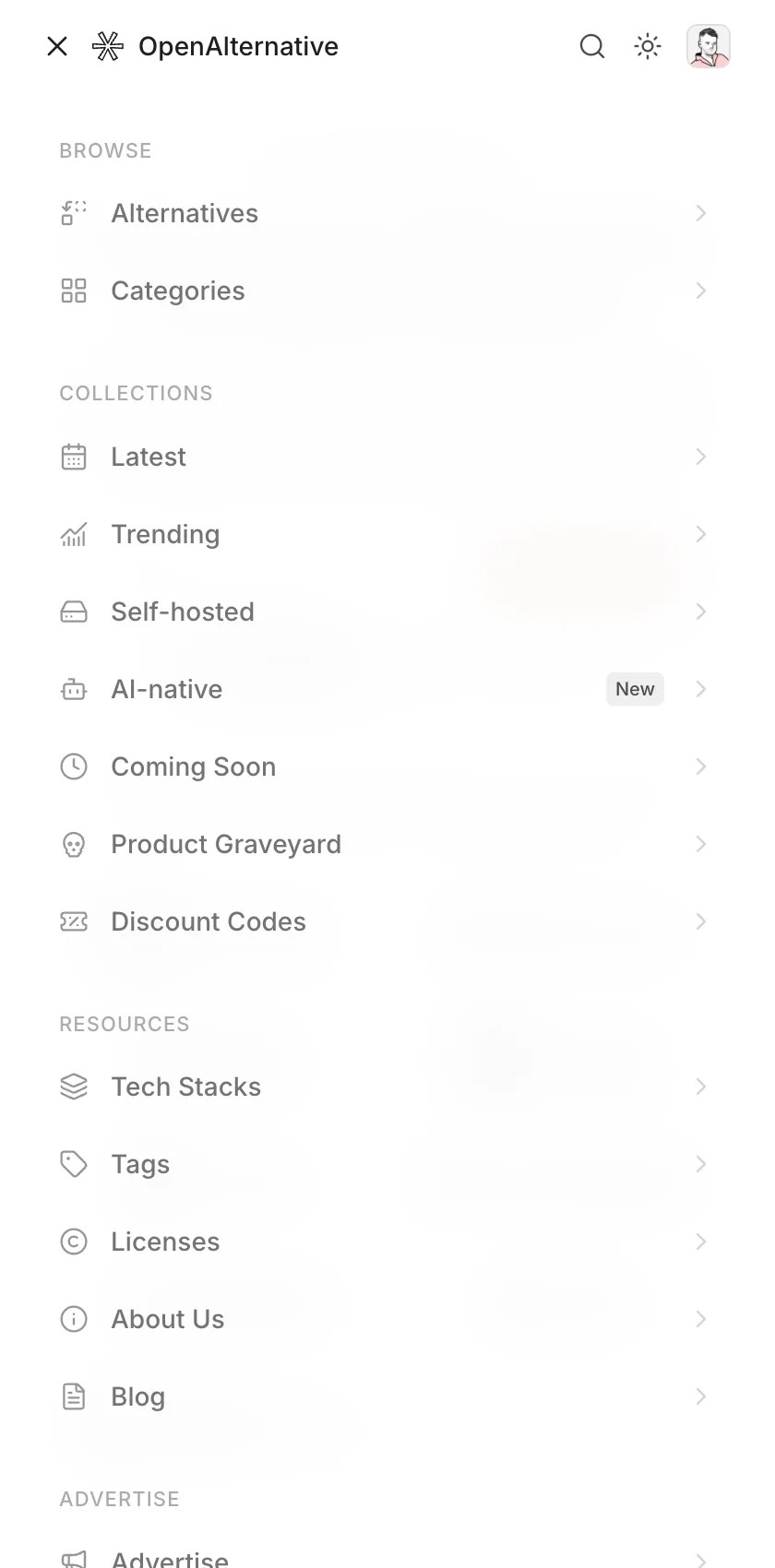
Mobile gets a full-screen panel instead of a cramped dropdown. Groups are rendered as titled sections, and it closes on Escape and on every route change.
Drop menu: true and the group's links render flat in the header instead. Labels are i18n keys resolved at render, so navigation translates with the rest of the site. Change a link once and it updates on desktop, mobile, and anywhere else the config is read.
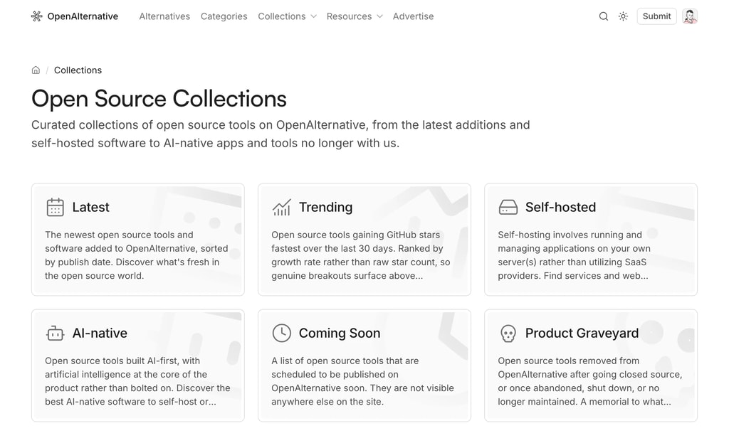
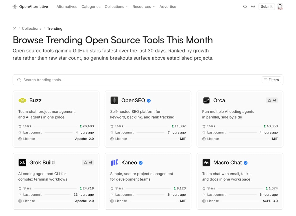
Curated listings like Latest, Featured, and Coming Soon, each defined by a single config entry
Directories accumulate tools faster than visitors can browse them. Collections are curated listings, saved filters over your tool query, that give people a shortcut to the slice they care about, and give you more pages to rank.
Each collection gets its own page with the full listing UI: search, filters, sorting, and pagination, all scoped to that collection.
Add the entry and the collection gets a page at /collections/[slug], a card on the /collections index, a header navigation slot, a footer link, and a sitemap entry. No other file needs touching.
where: merged into the public tool query, so any Prisma filter works: tier, status, category, dates, whatever you index
overrideParams: force a sort or filter, e.g. oldest-first for a "Coming Soon" listing
options: toggle the search, filter, and sort controls per collection
nav and badge: surface the collection in the header menu, optionally with a "New" label
Copy comes from your message files under pages.collections.<slug>, so titles, descriptions, and metadata stay translatable alongside the rest of the site.
Three collections ship by default: Latest, Featured, and Coming Soon. Delete the ones you don't need and add your own.
The separate admin and dashboard areas are now one permission-gated /app workspace
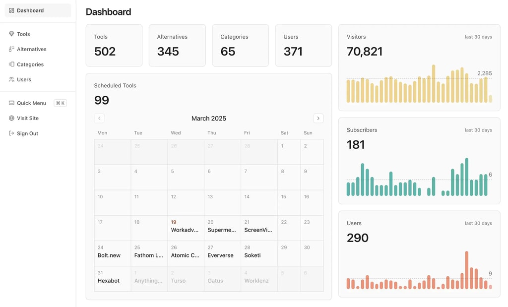
The admin panel and the user dashboard have merged into a single /app workspace. Instead of two separate areas, everyone signs in to one dashboard that adapts to their role: admins manage content, while every signed-in user gets their own submissions and bookmarks.
One workspace at /app: Content management, settings, and personal pages live under a single shell, and the sidebar shows only what your role can access
Permission-gated navigation: A declarative role model (can(user, permission)) decides what each user sees, replacing the hard split between the admin and dashboard areas
Old links keep working: /admin/* and /dashboard/* 308-redirect to their /app/* equivalents, so existing bookmarks and external links stay valid
Existing routes redirect automatically, so there's nothing to change in your deployment. Just sign in at /app.